Index
Design and Build Quality
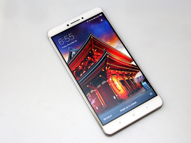
The design is a mixed bag. It’s a bit like a cross between a Redmi Note 4 and a Note 3, sprinkled with a generous dose of human growth hormone. This isn’t necessarily a bad thing, since the Redmi line looks rather good considering the price point.

The Max is just more of the same – a metal body with two plastic caps at each end, to house the antennae and keep costs down.
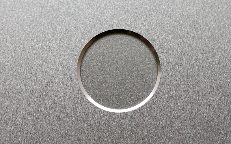
The main camera is located in the upper left corner, flanked by a dual-tone LED flash. The fingerprint scanner is also located at the back, which is understandable since mounting it on the front of the device would make the whole thing even taller.
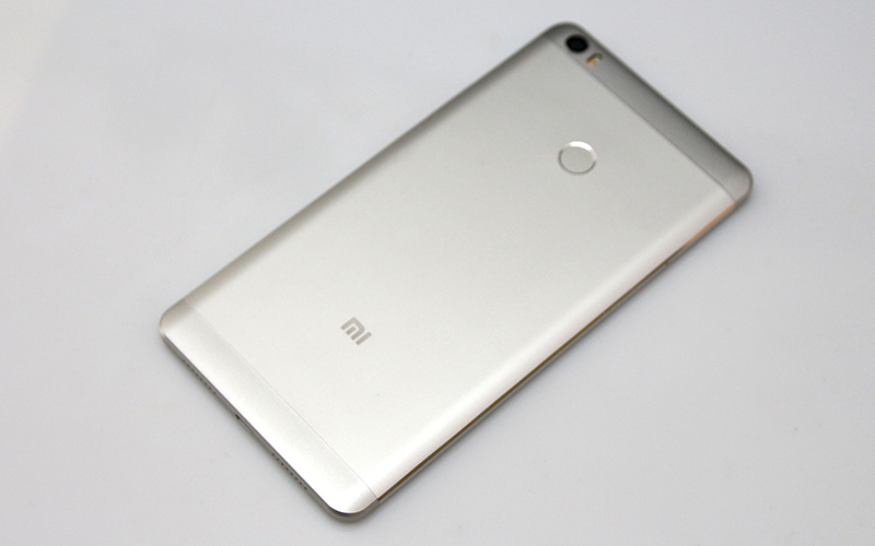
The frame is CNC-machined metal and feels quite good. The Max isn’t an ultrathin note, but it’s easily mistaken for one. Due to its big footprint, the 7.5mm thick device actually looks a lot thinner than it is.
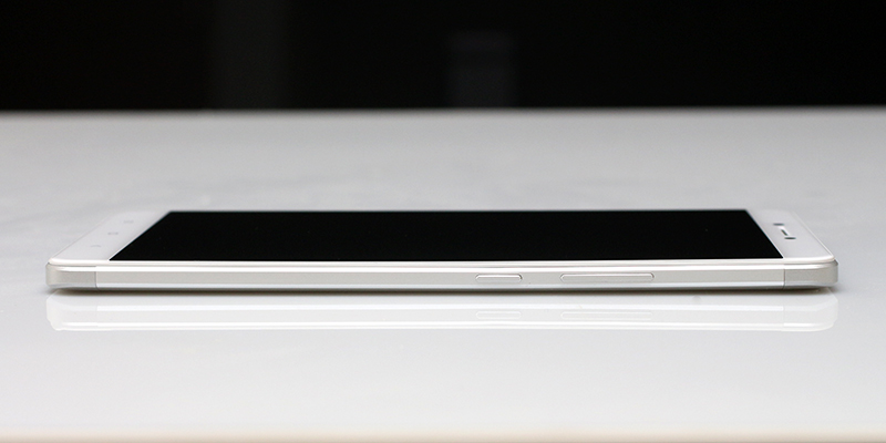
The volume rocker and power button are on the right-hand side, but they’re a bit “lower” than you’d expect on a regular phone. If they weren’t, you’d probably have a very hard time reaching them with your thumb.
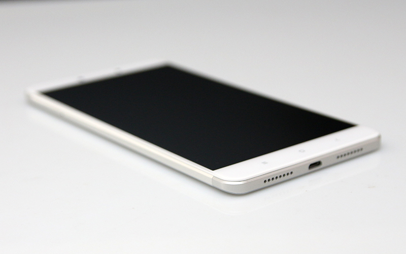
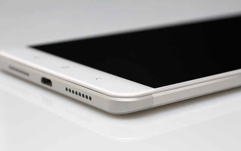
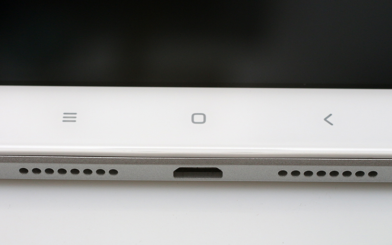
At the bottom, you’ll find a standard Micro USB port (no Type-C yet), and two speaker grilles. Well, only one of them actually houses a speaker, while the other one is there for symmetry. Again, nothing out of the ordinary, although we would have liked to see a dual speaker setup on such a huge device.
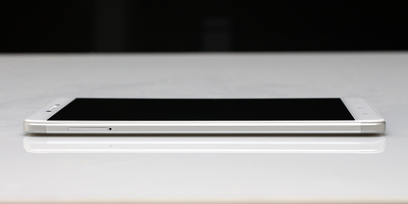
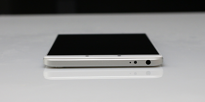
The IR blaster, noise-cancelling microphone and 3.5mm audio port are on top.
What about the front? It’s immense, so it had better look bloody good, and, luckily, it’s quite nice. Xiaomi uses slightly curved 2.5D glass, which is a nice touch on such an oversized device with thin, sharp edges.
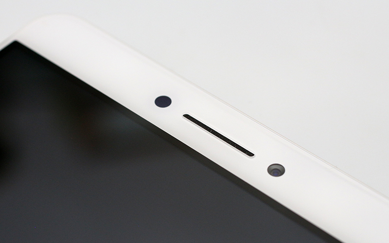
The brow houses the front-facing camera, proximity sensor and earpiece.
The chin is Xiaomi standard – just three nav buttons and that’s it.
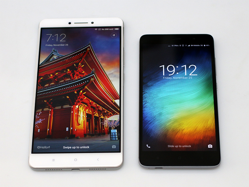
As far as aesthetics go, we did not like every single detail. For example, let’s take Xiaomi’s decision to offer the Max in Silver, Light Gray and Golden colour options. Granted, they all look rather nice, but they also share the same facia. It’s white, no matter which colour you choose.
This wouldn’t be much of a deal if Xiaomi and most other Chinese smartphone brands didn't incorporate that tiny black frame around the panel. It looks good on black devices, since it can create the illusion of a bigger screen or smaller bezels, but on a white phone, especially a phone this size, it just doesn’t make sense.
The sheer size of the Mi Max is the elephant in the room. It’s not the looks, it’s the size. See that tiny phone on the right? It's the 5.5-inch Xiaomi Redmi Note 3 Pro. Not so tiny then.
What about build quality? The Mi Max isn’t exactly a proper Mi-series phone, as it has loads of Redmi DNA. The Max is an entry- to mid-range device, depending on which SKU you pick. This also means that build quality is not on a par with Mi flagships, and it’s much closer to Redmi devices like the Note 4.
Luckily, Xiaomi has given the Redmi line a nice makeover over the past year or so, adding a number of all-metal designs with a good finish that’s not far behind flagship devices. The Mi Max looks and feels like a pricier device, which is good. The downside? Due to its size, the Max flexes under pressure and probably wouldn’t take nearly as much punishment as a 5-inch device. We think it would easily bend under a lot of pressure, so even if you can fit it in your front pocket, this probably isn’t a good idea.

