You can see that the reviewer wanted to say something nice about the iPhone SE, really was aware that they were testing a lemon but could not really say so.
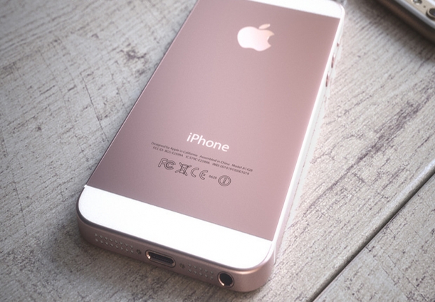
The hint comes when it makes a mention of the fact that the iPhone SE is the “spitting image of the iPhone 5S. The only differences are that the edges are the same colour and texture as the back of the device, it comes in rose gold, the Apple logo on the back is shiny, and there’s a small “SE” emblem on the back, reminiscent of the Machintosh SE from 1987.”
The Machintosh SE is code for all hacks who had the misfortune of using one in the 80s. Lots of press used them and came to loath them. The software was as limited as a steel coffin, the screen was tiny and the boxes had a tendency to catch fire when you were on deadline. If it did not catch fire, the small bomb sign used to make an appearance far too often.
“In the hand the body feels sharp and hard, with unforgiving edges which are only acceptable because of the phone’s diminutive size. The hard edges are easier to grip than the slippery rounded sides of the iPhone 6S, and particularly the large 6S Plus, but they hurt my palms after clutching it for an hour or two,” the reviewer moans.
This is not the sort of design that reviewers expect from the likes of Apple, and the reviewer is making it as clear as he can.
As you would expect though the main source of anger is the fact that Apple shrank the phone and copied the iPhone 5S design. This not only dated the phone but made it useless for many people.
“Using a 4in screen in 2016 is a compromise. Websites feel very cramped, apps often leave only a small amount of screen to the content they’re trying to display and buttons can end up very small making tapping them a bit of a challenge,” the review said.
So did he have anything positive to say? He did his best poor thing and ends up damning with faint praise. He said that iOS works better on smaller devices, where your thumb can reach all areas of the screen. Activating the Control Centre feels more consistent, as does swapping between apps using the task switcher on the smaller screen.
“It might make a good first iPhone, but it feels like a step backwards - the 4in screen is very small for browsing, viewing photos, apps, games and typing. Smartphones, and what we consume on them, have moved on in the four years since a 4in iPhone was first unveiled, and the iPhone SE feels much less engaging than a 6S.”
Oh dear.


