Index


Review: 16.4 inches of Sonyness with an Apple aftertaste
It's not easy to draw attention to new desktop replacement notebooks these days. There's simply too many of them around, in all shapes and sizes, from bulky, cheap and ugly DTR machines, to stylish, business oriented models for smug people with ugly ties and gaming notebooks. The latter tend to annoy us like a swarm of ill tempered wasps on a nudist beach, so we do our best not to talk about them, as they usually make as much sense as a third nipple on a male mammal.
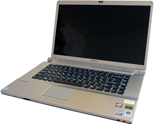
So, where does Sony's Vaio VGN-FW139E fit in? Well, nowhere to be honest. It's not expensive, but on the other hand it's stylish too, making it a nice companion for business people. It's not a gaming machine, either. God never meant for notebooks to be toys, anyway, but it still packs enough power to run undemanding games. It's not an overweight chunk of hardware like most 17 or 18-inch machines. The main thing that sets it apart from most 15.4 or 17-inch notebooks is its screen size and awkward resolution, packed in a compact chassis.
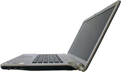
Sony opted for a 16.4-inch screen in a cinematic 16:9 aspect ratio. Its resolution is 1600x900, not something you see every day. Basically it's supposed to provide you with the benefits of a 17-inch screen in notebook with the footprint of a 15.4-inch unit. It lives up to expectations, and in some respects even exceeds them, offering a higher resolution than most cheap 17-inch notebooks (1600x900 vs. 1440x900), whilst keeping the size and weight down, almost on par with 15.4-inch models. The Vaio measures 38.4x26.2x3.7cm and weighs 2.9kg, just a tad more than an average 15.4-inch notebook.
Now, let's say a thing or two about its hardware and cost before moving on. Sony packed the FW139E with quite good components, such as Intel's Core 2 Duo P8400 clocked at 2.26GHz, the PM45 chipset and 3 gigs of Samsung's 800MHz DDR2. Its 250GB 5400rpm hard drive should be enough for most users. You also get n-draft WiFi, Firewire, Bluetooth, HDMI, a 1.3MP camera and a Memory Stick / SD card reader.
Luckily, Sony chose not to use Intel's IGP and opted for ATI's HD 3470 with 256MB of DDR3 instead. We have to admit this isn't a very powerful GPU, and we'd like to see something even better, mainly due to the high native screen resolution, but it's still a much better choice than an IGP. Although you can't expect to it to run Crysis, it will still cope well with many popular games, and let's not forget about HD video decoding and DirectX 10.1 support, either. All in all we think it's a good choice. It doesn't drive the price sky high and it doesn't consume much power.
There you have it, we've got some rather nice hardware inside a stylish notebook notebook with a Sony sticker on it. You'd expect the price to be rather high, but at under $1,100, the Vaio starts to look like a pretty nice deal. You can get similarly equipped 15.4-inch notebooks for a bit less, but you'll end up with a 1280x800 screen, compared to Vaio's 1600x900.
The look of love (or hate)
Here's where it gets tricky. After publishing the preview, a couple of my colleagues told me they hated its looks. They said it was hideous, too Apple-esque for their taste, and they found some details, such as the oversized screen hinges with the power connector and power button, a bit too tacky.
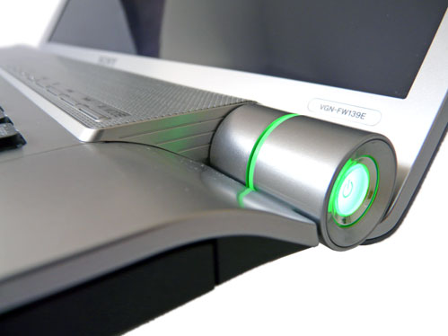
I beg to differ. True, the keyboard looks like it came straight off a MacBook, but who's to say only Apple should feature such a design? After all, we've seen manufacturers borrow dozens of design ideas in the past years. If it works, why not use it? It's not easy to come up with something new and original these days, as the designers seem to have tried just about anything. As for the hinges and power button, I think they look quite nice, although the illumination is a bit too much for my taste.
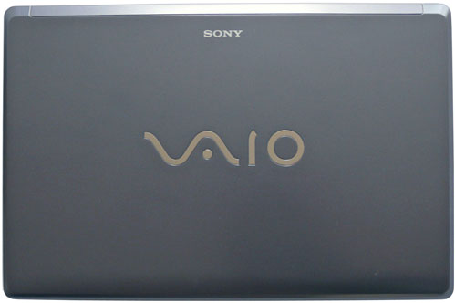
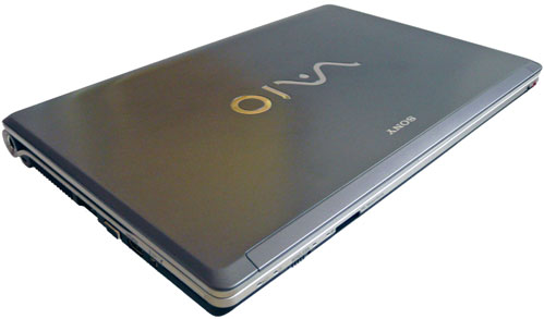
There are some things I didn't like, either. The lid is one of them. The Vaio logo is too big if you ask me, but this is true of all almost all Vaio notebooks. There's a white color option, as well, but it looks a lot better on pictures than in real life. Apart from the logo, I didn't like the finish, either. The color, a pale blueish shade of gray, is nice. However, it's just too smooth and the smudged fingerprints which stick to it like a chewing gum to asphalt would make life miserable for CSI people if somebody were to kill you and nick it.
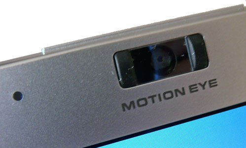
It doesn't have a latch, so you'll get it smudged around the edge in no time. Some of your precious bodily fluids will easily end up on the camera lens in the process. Furthermore, the bezel doesn't feel quite right. It's flimsy, bends easily and at the bottom you could fit a coin in between the plastic and the screen. This is not something we've come to expect from Sony products.
Thanks to the 16:9 screen and unusual keyboard, the Vaio looks quite slim and elegant. The curved, sloping chassis is a nice touch, which offsets the sharp edged design, along with the round power button and hinges. The textured touchpad might be a bit too much, but it's not a big deal.

Overall, Sony did well in the design department. The Vaio FW-139 looks quite good, its design is simple, subtle and elegant and it looks a lot better than most similar notebooks on the market.
